Visualisation Tools
The perfSONAR MDM solution collects network measurement data across the end-to-end path, and presents the collated information as a complete picture to the user using visualisation tools through a standard user interface. The following are examples of some of the tools.
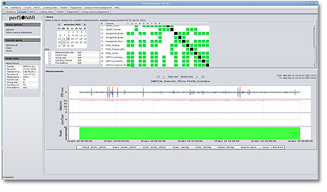
Circuit Tab visualisation tool for monitoring (based on “HADES”)
The perfSONAR MDM solution collects network measurement data across the end-to-end path, and presents the collated information as a complete picture to the user using visualisation tools through a standard user interface. The following are examples of some of the tools.
Circuit Tab visualisation tool for monitoring (based on “HADES”)
- Each square in the grid shows the status of the IP connections between different NRENs’ network measurement points.
- The graph shows jitter, packet loss, one-way delay and trace route.
- Histories can also be interrogated through this screen.
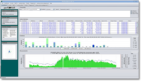
Interface Tab visualisation tool for monitoring
- The table shows the list of router interfaces across the domains and the graphs show the link utilisation, input errors and packet drops.
- This screen provides the information that enables NRENs to identify any errors within other domains; information that would not otherwise be available without time-consuming investigations.
- Issues can be tracked across the entire multi-domain environment.
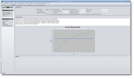
BWCTL visualisation tool for trouble-shooting
- Available bandwidth measurements tests can be conducted across multiple domains on demand. NOC and PERT engineers can customise the test they want to run and specify parameters.
- The result is displayed on a graph and also in tabular form.
- It supports IPv4 and IPv6, TCP and UDP protocols.